By prioritizing user needs and conducting iterative user testing, we were able to significantly improve the user experience of the online car buying checkout flow at Cars24. This resulted in increased user engagement and a positive impact on business goals.
Project Impact & Metrics
The redesigned checkout flow resulted in significant improvements:
16% increase in average booking per user.
Increased percentage of users booking multiple test drives: 2 bookings (14% to 22%) and 3 bookings (11% to 13%).
Improved user intent to convert after a test drive: conversion rate from test drive to purchase token increased for users booking 2 test drives (19% to 31%).
2.
Product research
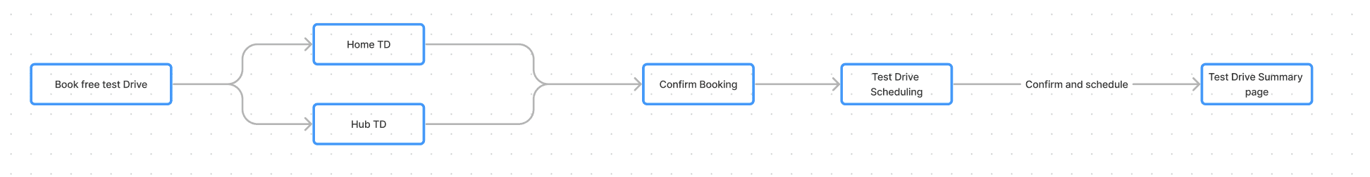
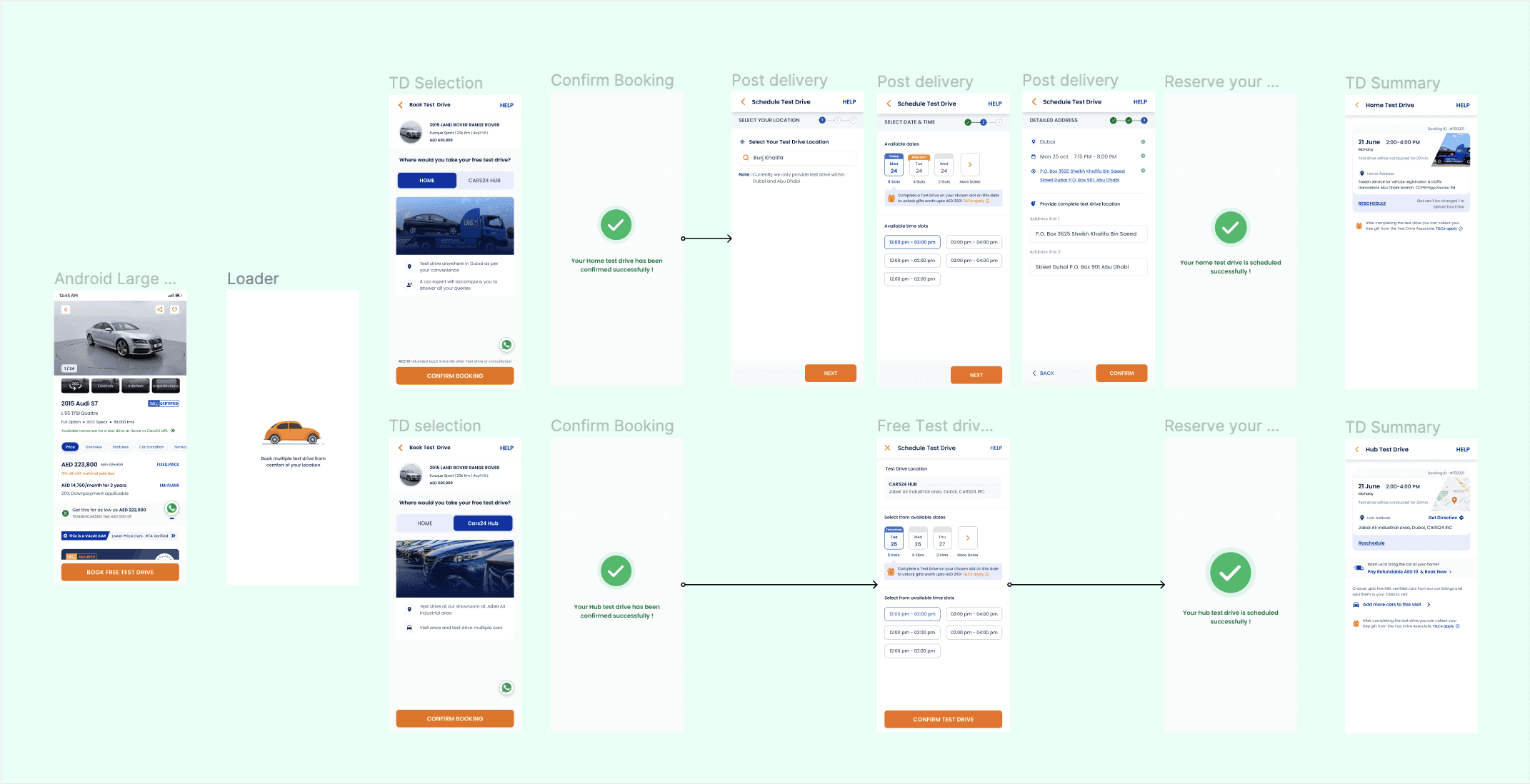
The initial solution focused on eliminating unnecessary pages (process, trade-in, and booking summary) and prioritizing the test drive booking process. This aimed to minimize cognitive friction for users wanting to explore cars.
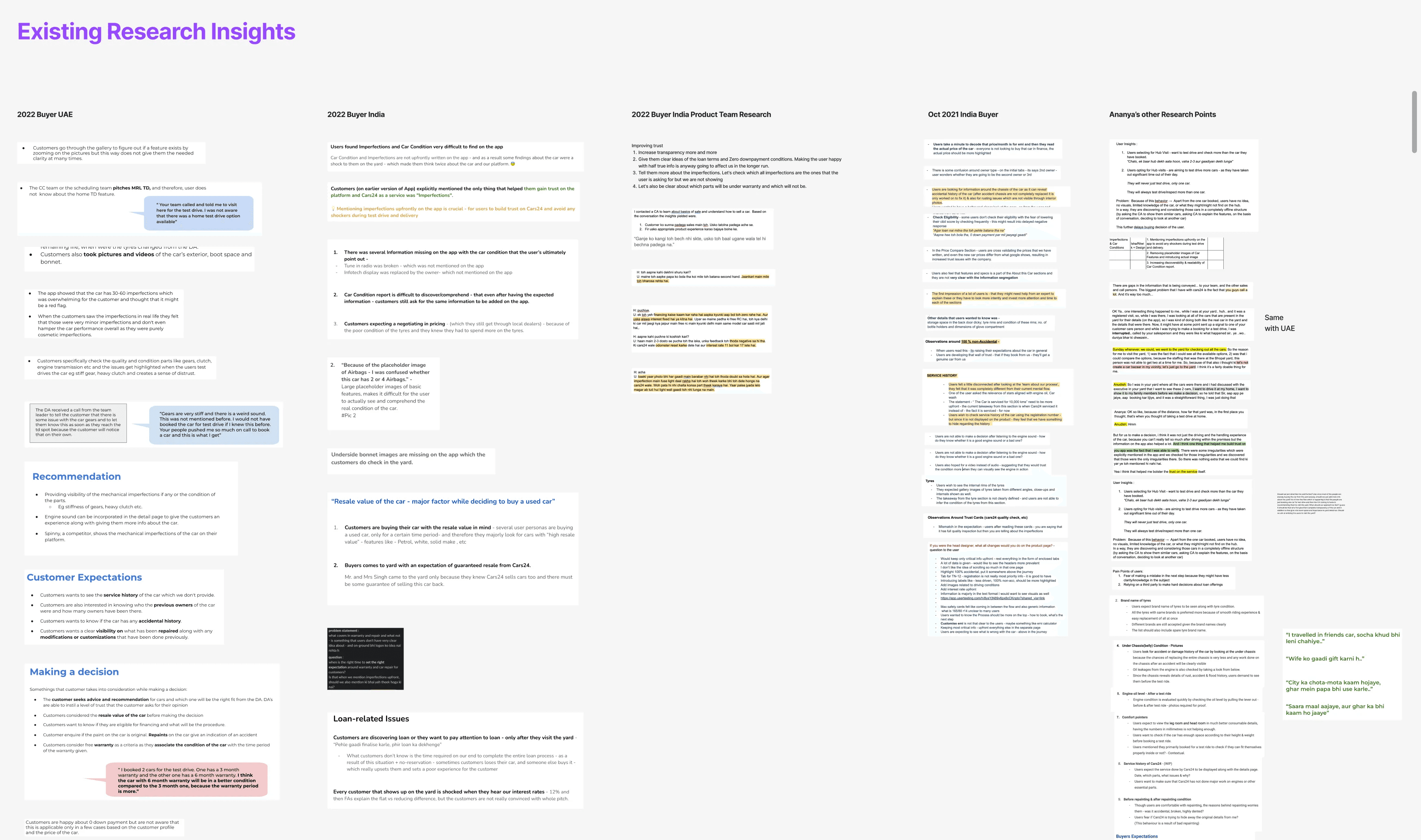
Diverging on solutions
We conducted multiple rounds of user testing with the wireframes, iterating on the design based on user feedback. This helped us refine the flow, prioritize booking options, and simplify location selection.
How Might We


HMW streamline the booking flow for a smoother user experience?
HMW reduce drop-offs and increase booking completion rates?
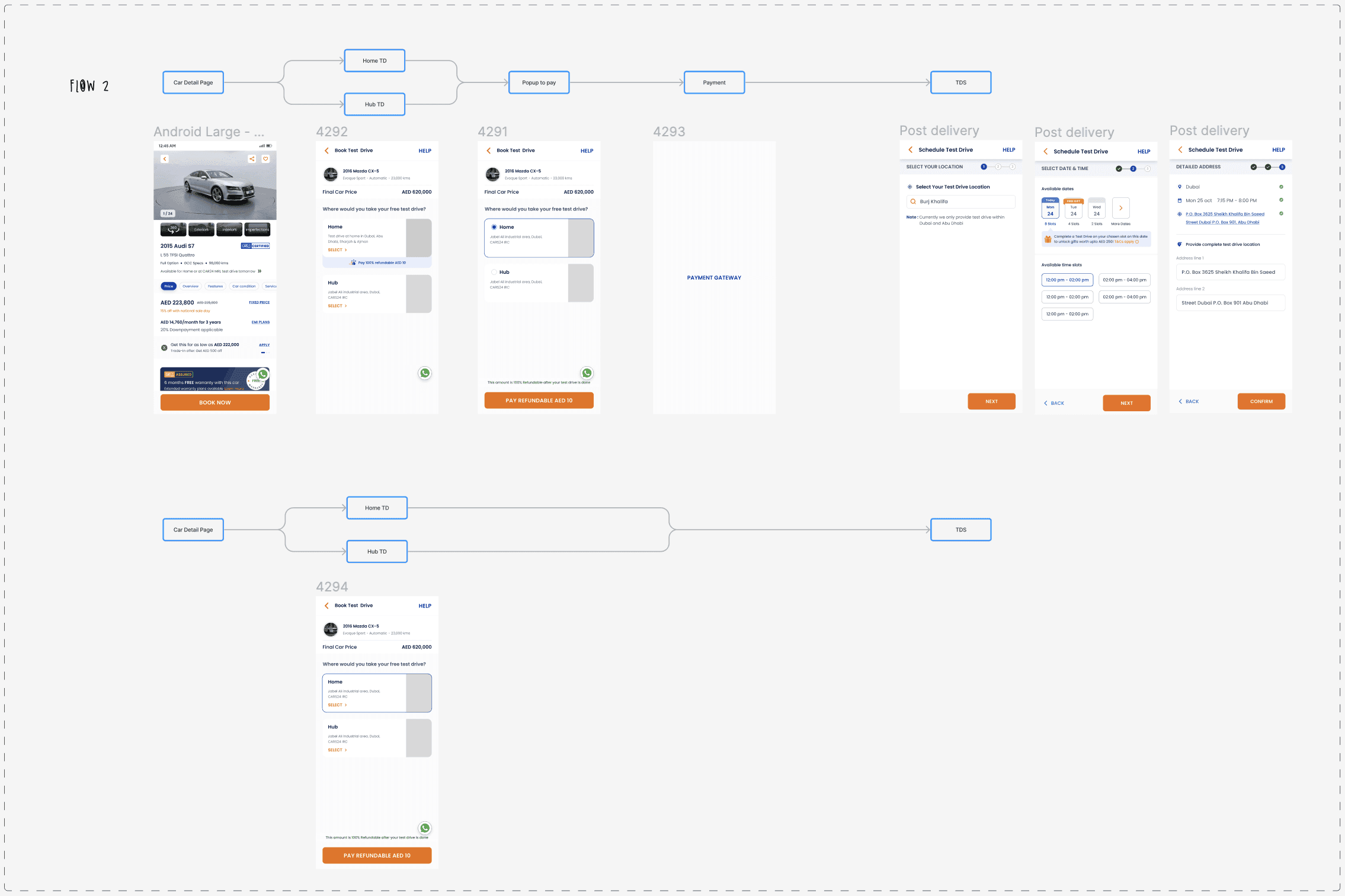
After successfully having the HMW’s laid out, I had a very clear understanding of how we need to stream line the flow. At this stage I only focused on how to solve the user problem without thinking of any kind of business or tech feasibility issues. The Main Idea was to get rid of the Unnecessary pages such as the process page, the trade-in page and also the booking summary page, and push users towards booking a test drive on priority if they like the car.
1.
Identifying the Problem
The initial user research conducted by our dedicated teams revealed several pain points within the existing checkout flow. These included:
Unnecessary Pages: Users found the process page redundant, the trade-in page irrelevant during test drive booking, and the booking summary page confusing. This led to drop-offs throughout the funnel.
Global Considerations: Users in regions with slower internet speeds experienced extended loading times due to these extra pages, further hindering the booking process.
Cognitive Friction: Excessive steps and decision points created friction, hindering users from achieving their goal (booking a test drive) quickly and efficiently.
Business goals?
Increase the number of users completing the test drive booking process.
Improve the overall user experience of the online car buying journey.
Reduce drop-off rates within the U2BC funnel.
Click on the button to jump directly on that part of the process
Overview
This case study explores improving the online car buying experience at Cars24, focusing on streamlining the steps from browsing to booking confirmation. Thus I'll share the challenges, solutions, and results of this user-centered design.
Project Timeline
July 2023 (research, design, implementation)
Tools
Figma

3.
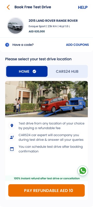
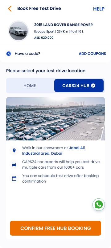
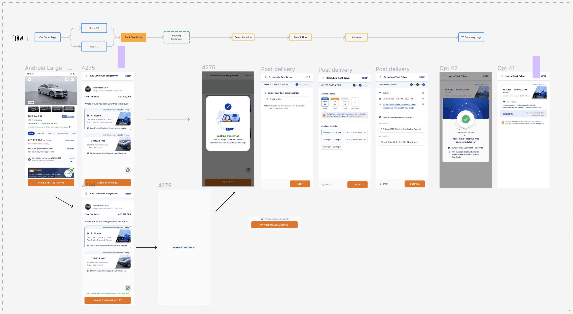
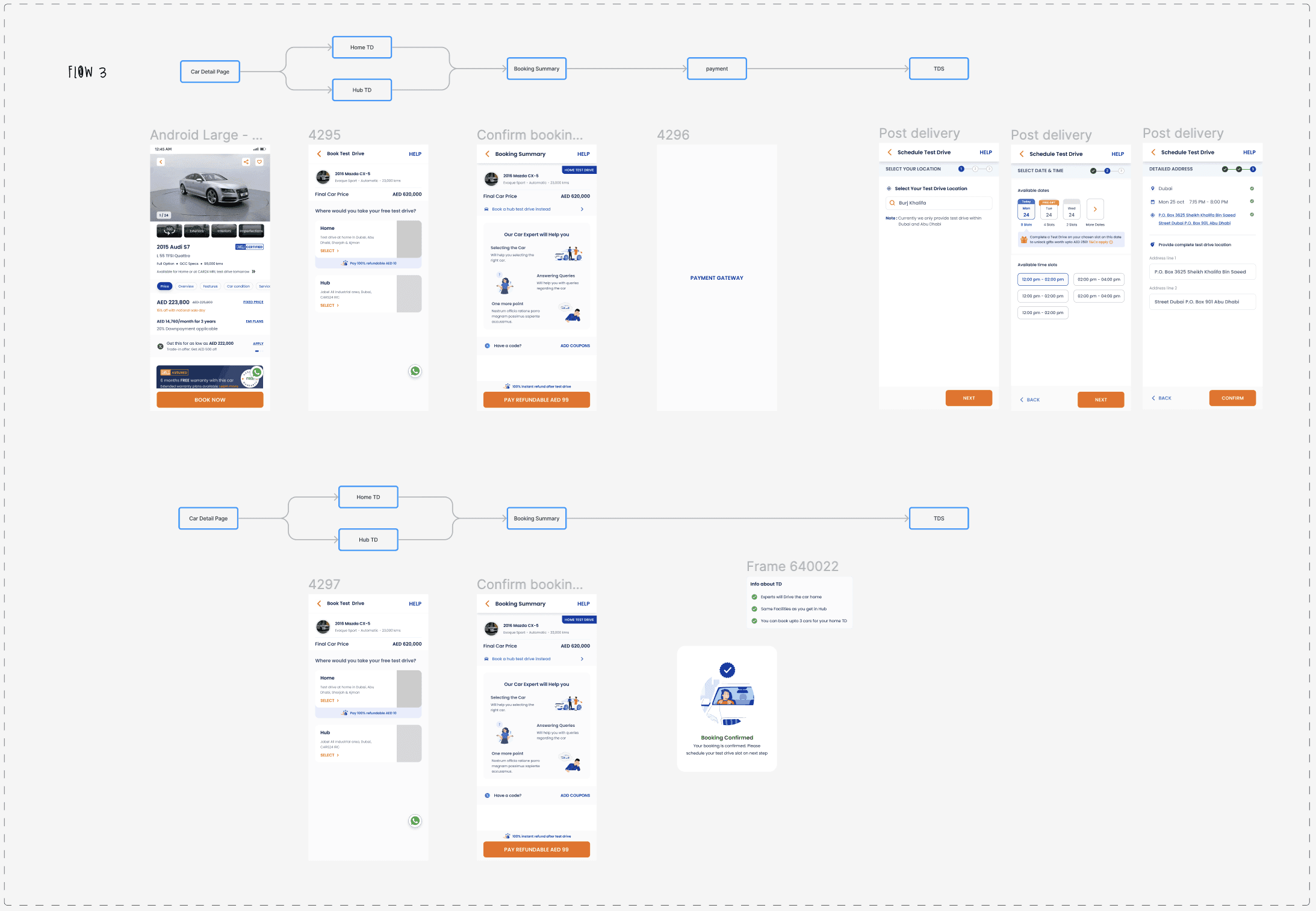
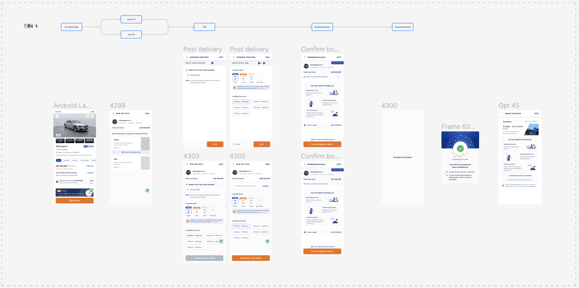
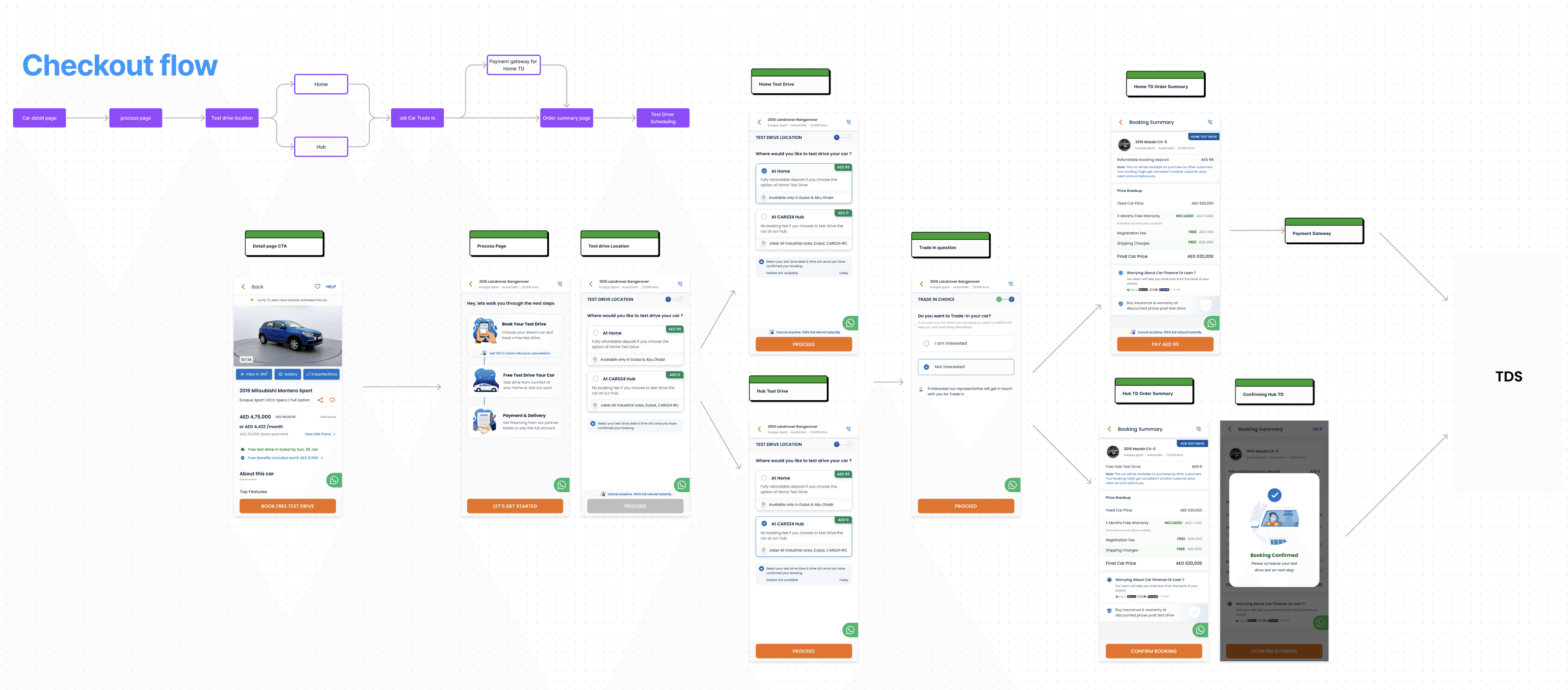
Final Flow & Screens
While the focus of this project was on improving user experience through layout and flow, visual design elements like clear calls to action and user-friendly interfaces were also incorporated.